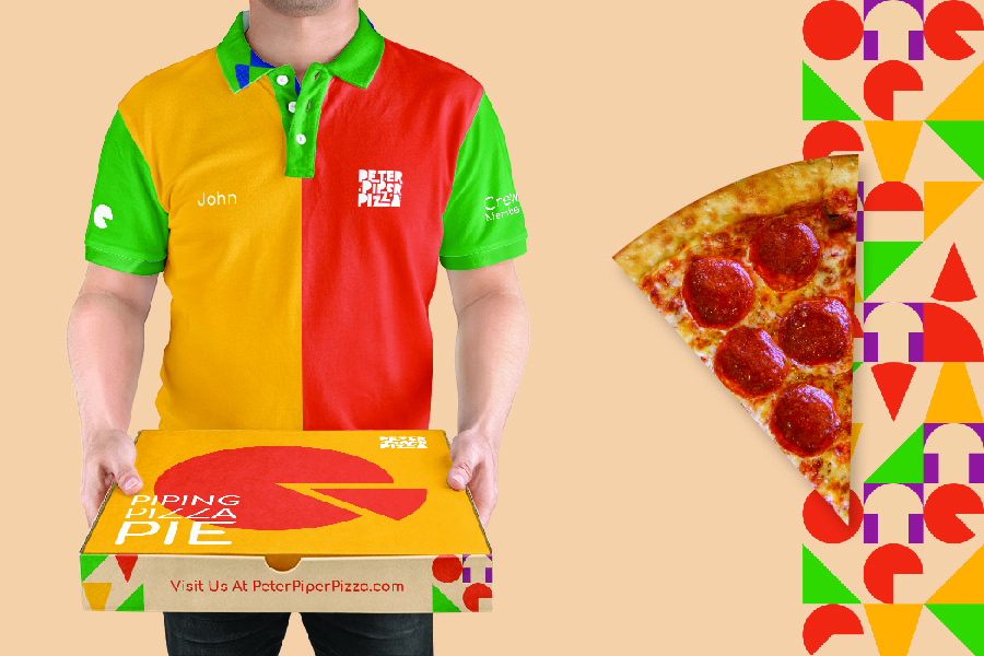
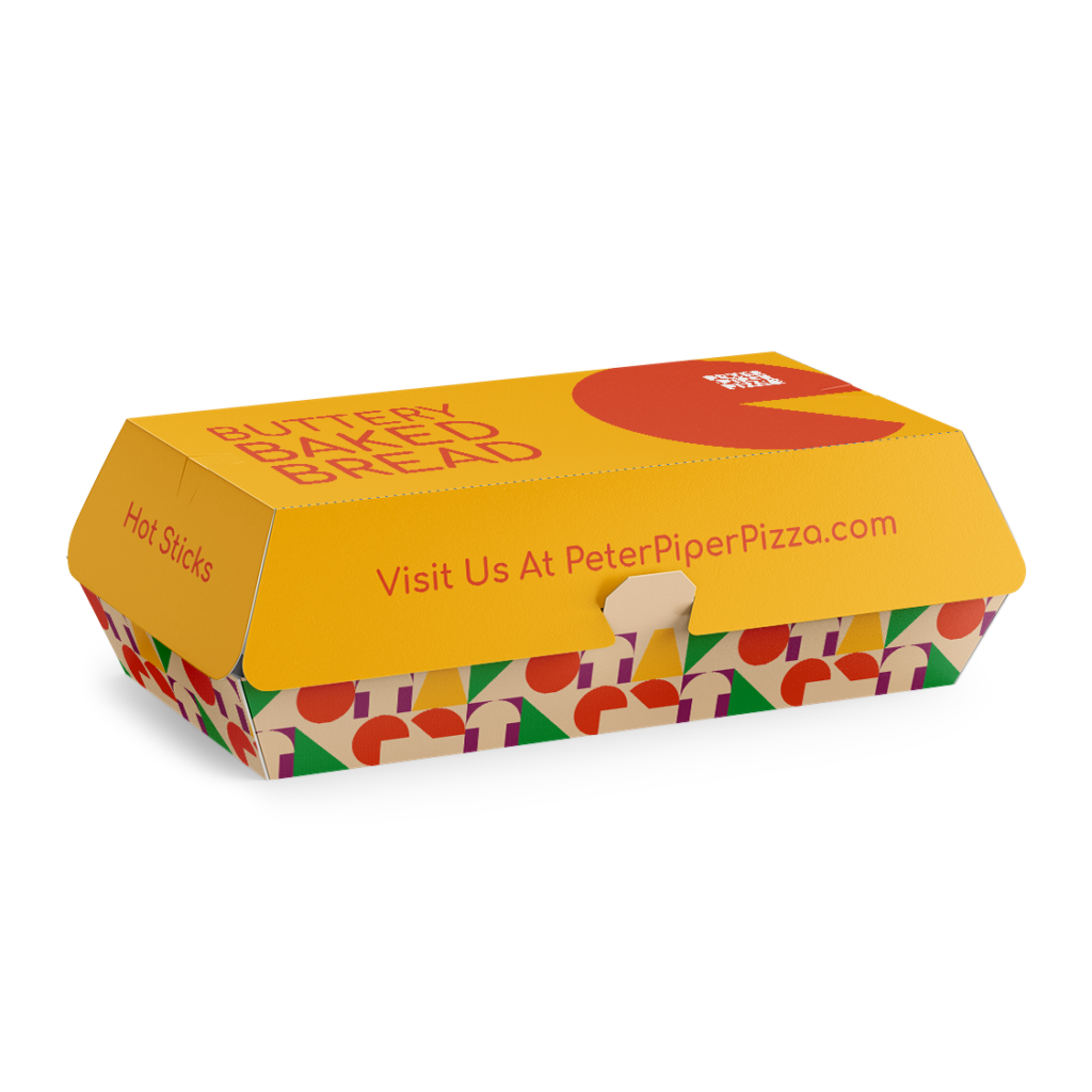
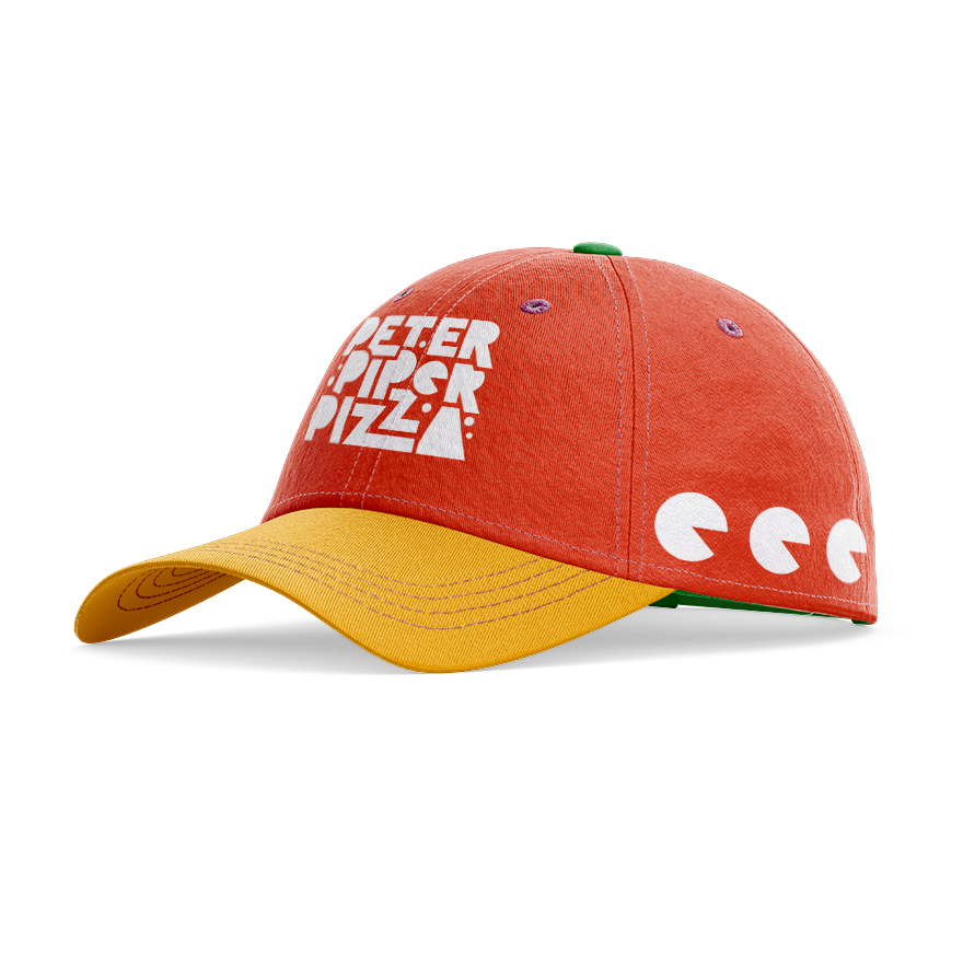
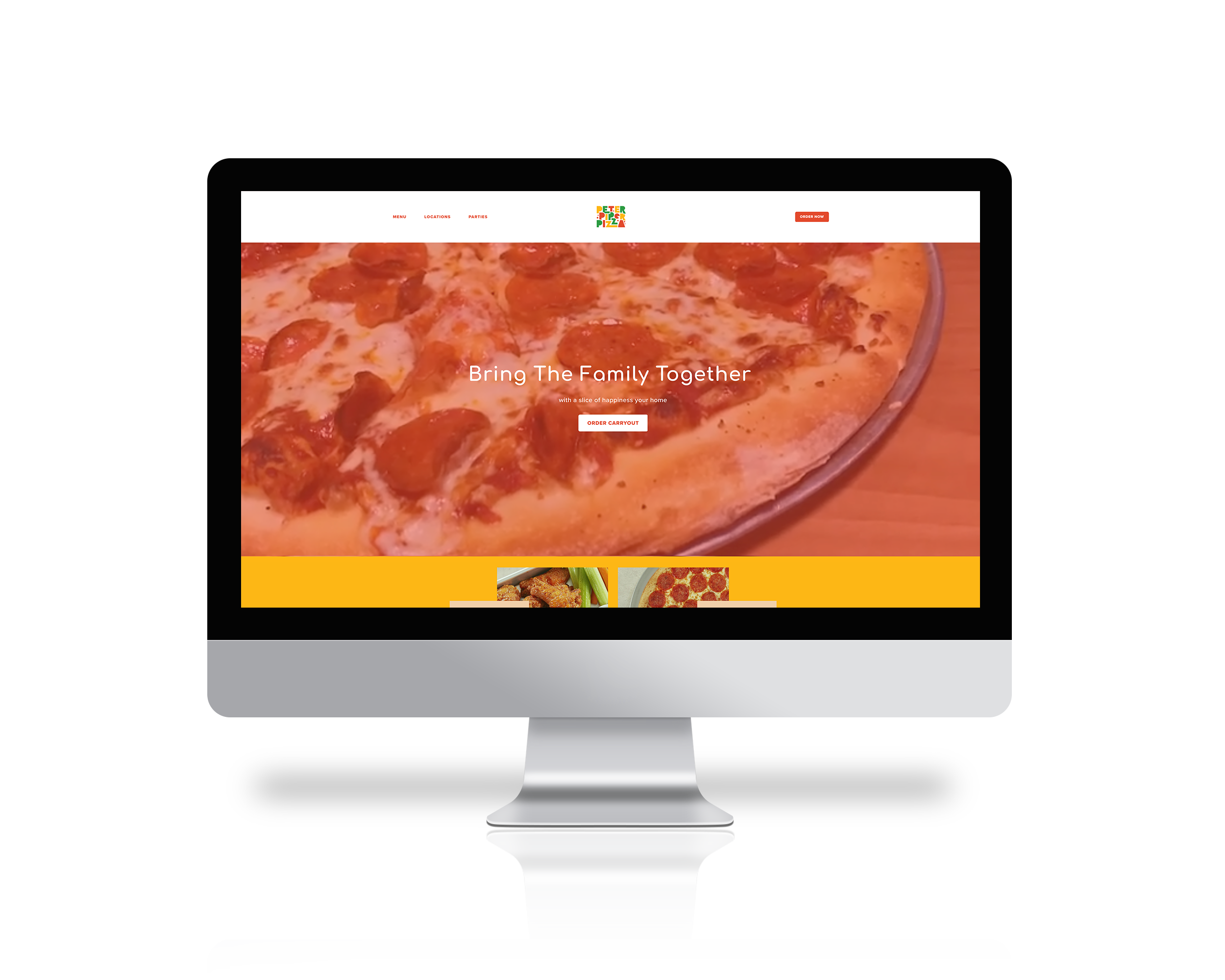
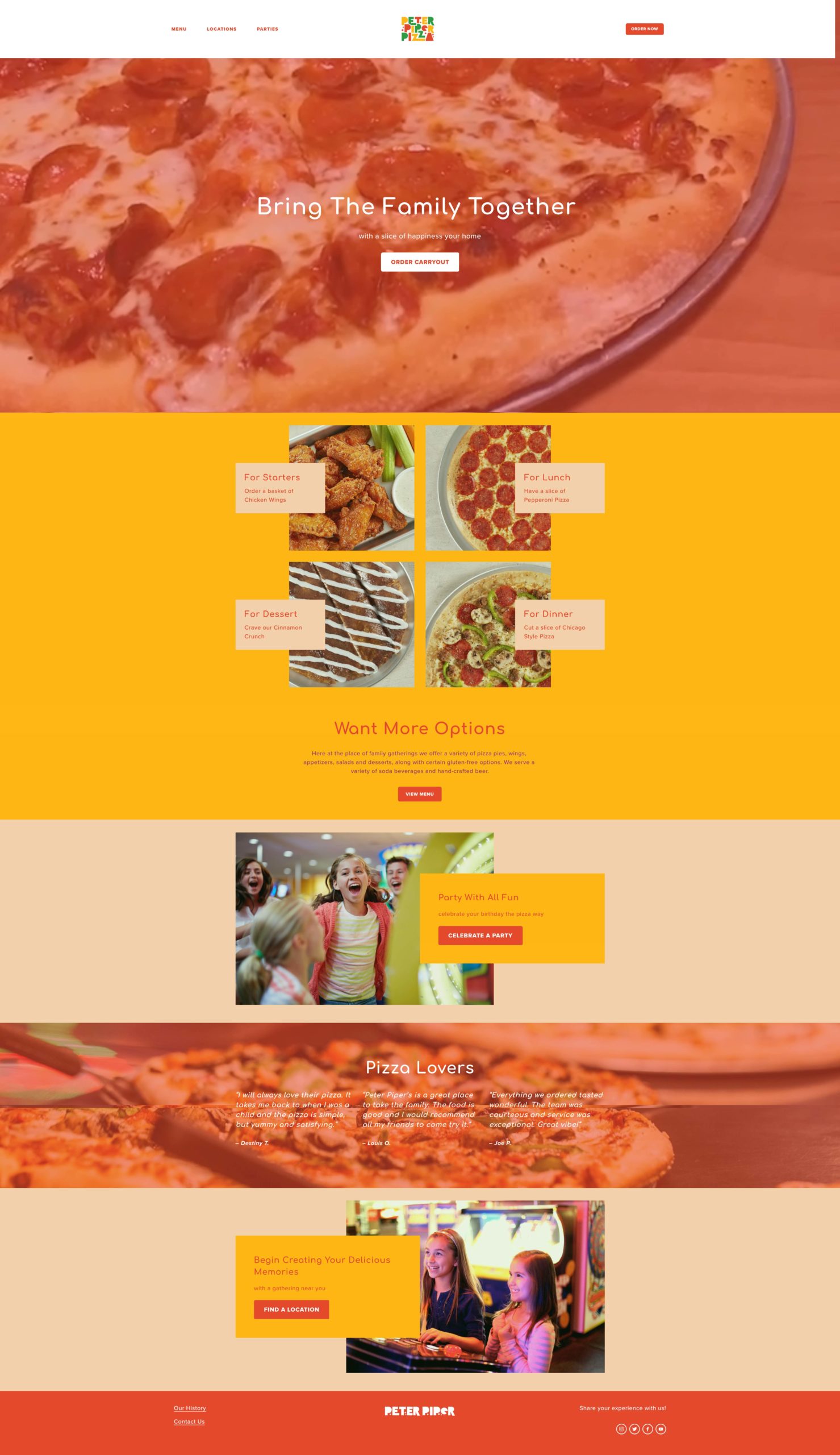
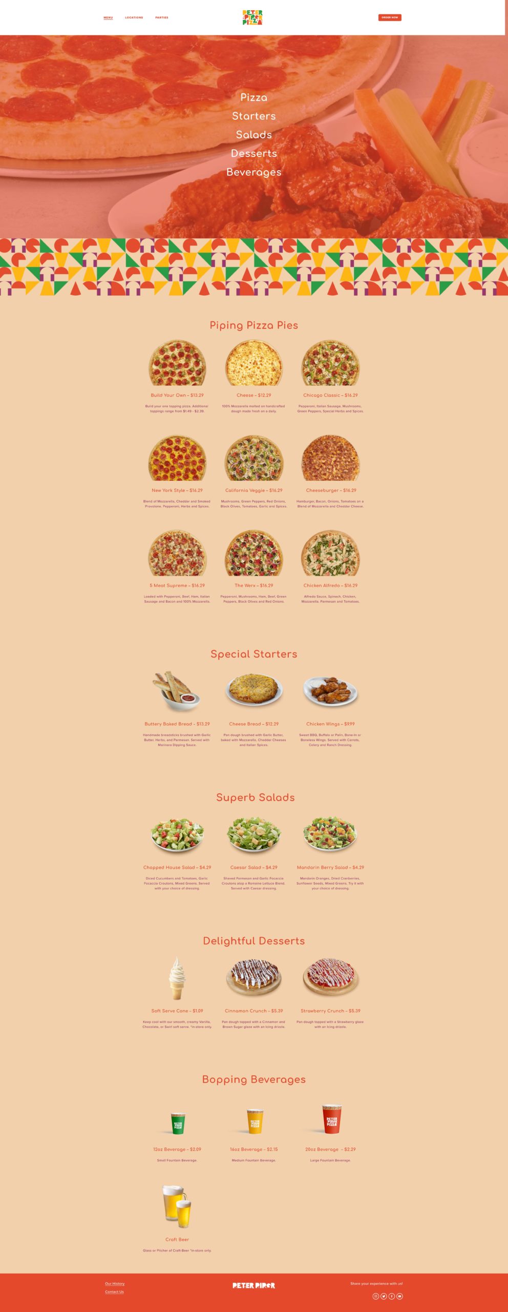
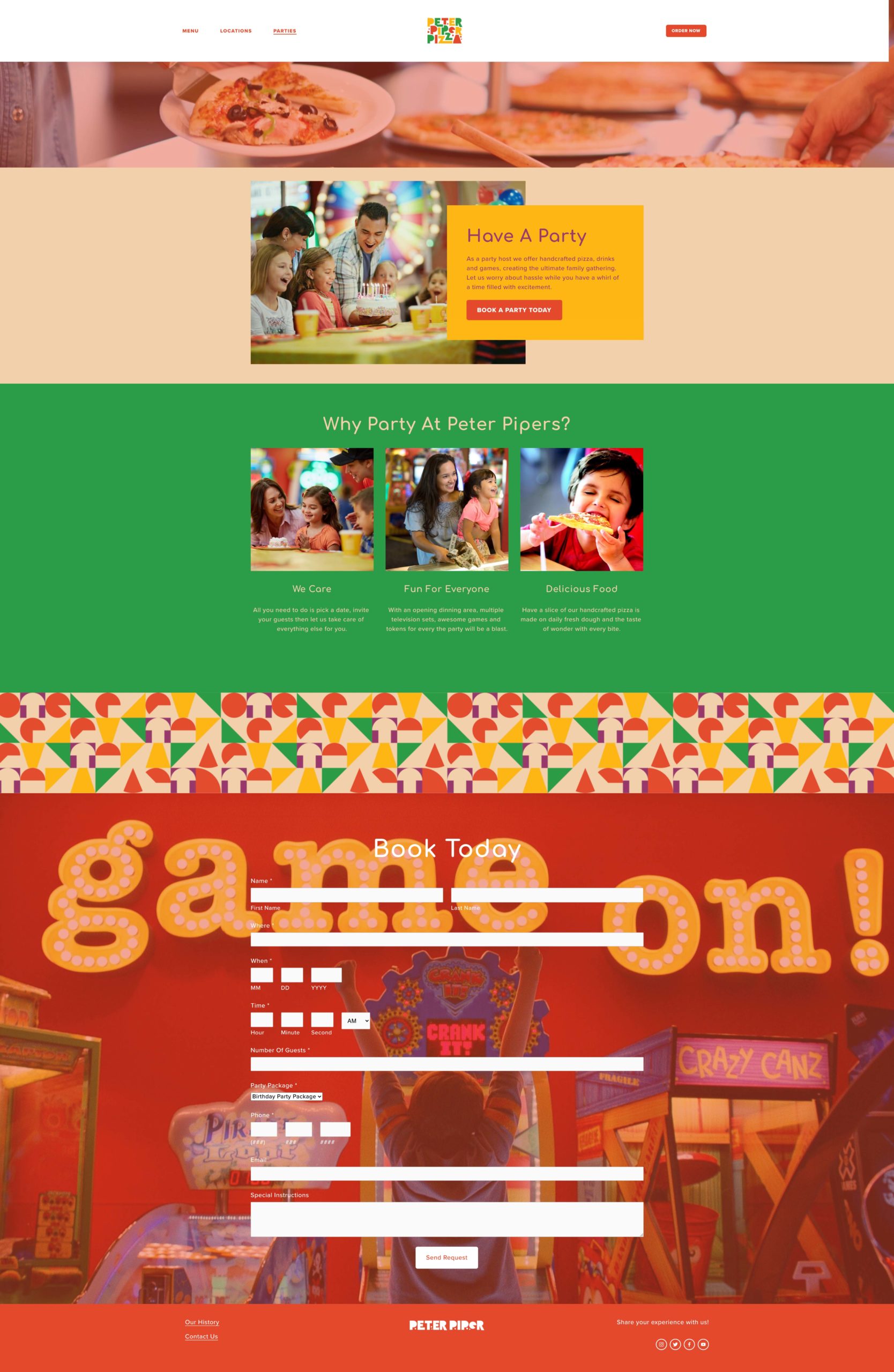
Peter Piper Pizza’s main objective is to remind people of the brand’s strong history and reconnect with their sense of nostalgia. At the same time, the brand aims to balance this with a modern style that matches the restaurant interiors. Peter Piper Pizza represents fun experiences and the creation of memories with every visit. Memories that will last a lifetime, memories of fun times that will be passed down from generation to generation. To showcase this, the rebrand includes a new brand strategy, colors, icons, and patterns that highlight the brand’s values of family, fun, and food. This will help reconnect with the audience while equally focusing on food and entertainment.
Brand Strategy
Peter Piper Pizza is a place for family gatherings. By enhancing brand cohesion and refining messaging, the pizza company proudly showcases its commitment to serving quality food and fun that brings people together. This approach strengthens the company’s connection with loyal customers and attracts new guests seeking a welcoming atmosphere. By emphasizing shared experiences and joyful moments, the brand continues to be a destination where lasting memories are made. This ensures that the company maintains the happy, fun, and friendly environment everyone loves.
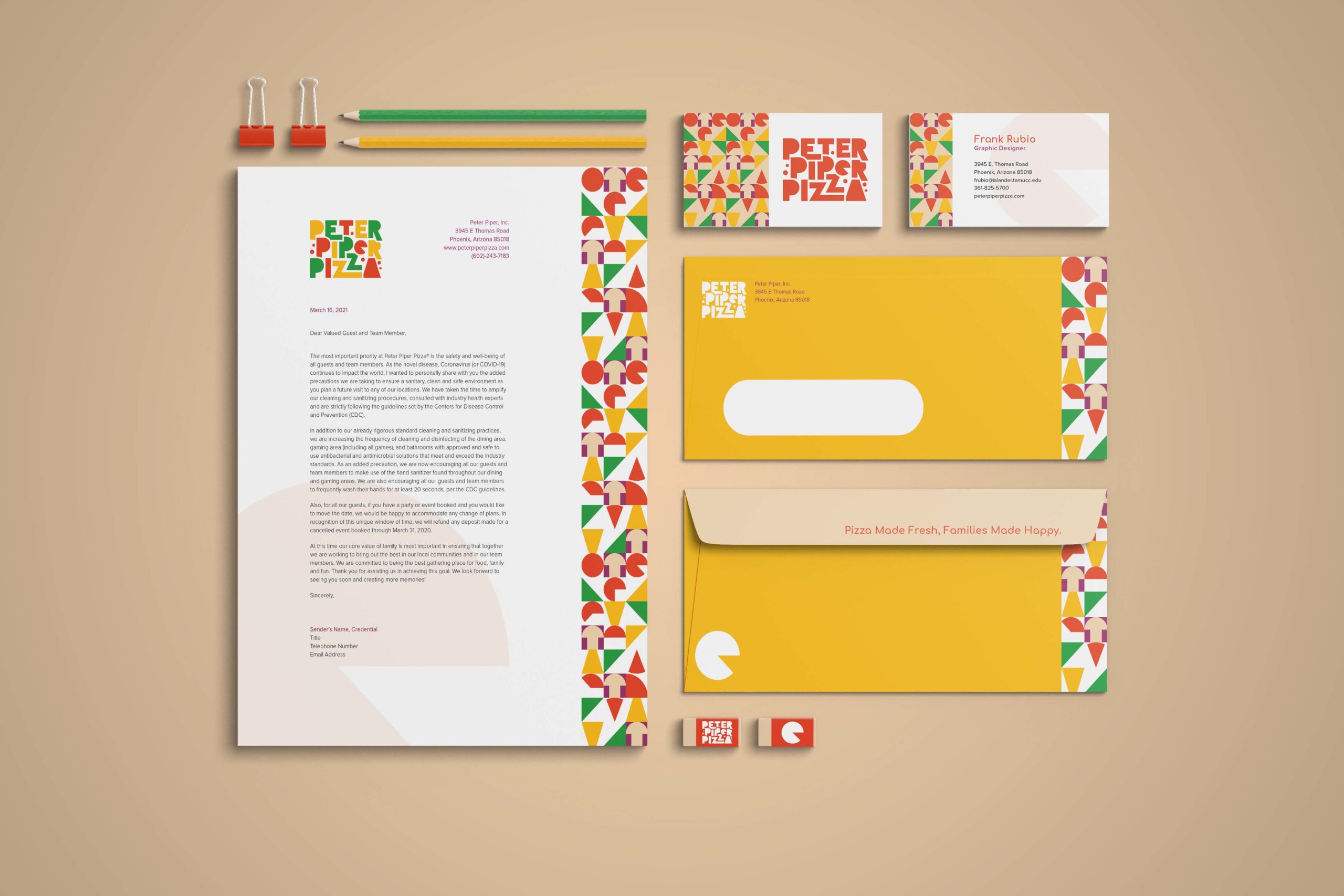
Visual Identity
Inspired by the Bauhaus movement, several sketches were based on shapes. The next source of inspiration came from the various ingredients used to make pizza, simplifying them into shapes and incorporating them as letterforms. Experimentation was key to representing how ingredients combine and blend in the oven. Letterforms were placed close together or interlocked to reflect this idea of merging flavors. Logo option number two was chosen because it best embodies this concept.