The big idea for Mystery Scene’s rebrand is to create a magazine that showcases the ins’ and outs’ of the mystery and crime genre in literature, film and television. Overall, this will make it the top source of inspiration and entertainment for its target audience.
The new magazine will present the information in a way that is engaging and exciting, keeping the reader curious to read and know more about the mystery, the crime, the detective, or even the criminal. Maintaining cohesion within the rebrand will allow for a specific atmosphere of solving a mystery to be created at the beginning of the cover. Thus, allowing the magazine to have the ability to draw readers in, leaving them wanting to know more about the story. This will result in the gaining of continuous subscriptions and new visuals, giving the Mystery Scene an edge over its mystery and crime competitors.
Logo Sketches
The initial thirty thumbnail sketches of the logo where to explore the different ways to represent a gripping mystery. Being able to invoke all the chilling and thrilling actions a mystery entails was one of the goals for the logo that was to be used as the masthead for the magazine. At the same time the logo needed to be bold and legible in order to stand out in a crowd of other magazines.
Refine Sketches
After narrowing it down to four potential logos, refine sketches were completed to further understand the makeup and construction of each logo. In edition a submark/icon for the brand depicting a fingerprint was taken into consideration to further add to the overall narrative of solving a mystery or crime.
Logo Digitization
The digitization process began in Adobe Illustrator by taking a modern bold san-serif typeface and manipulating it to create the following iterations of the logotype you see to the right.
By manipulating and combining different letter forms the logo was able to give off the sense of curiosity and maintain a strong presence. The type was also created to resemble the typography seen in serial killer letters and in ransom notes. Referencing this aspect of a crime/mystery at the start of the magazine gives the audience a notion of wonder, leading to their initiative to flip through the pages and solve the spooky mystery.
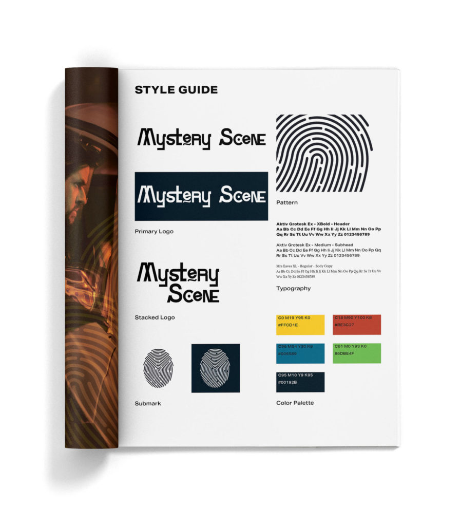
Brand Identity
People appreciate a story with well-developed characters, plots, storylines, setting and twists that engulf them in the narrative. This is what Mystery Scene strives to create, to create that feeling the audience gets when they’re at the edge of their seats, grinding their teeth, wondering what will be uncovered next. With a new logo, color palette and typography the brand will be able to tell a story the audience will be thrilled to read.
Color Palette
Providing pops of color to the obscure, mystifying and moody imagery will give the layouts of each spread a strong deal of contrast. This will also enhance the readers’ points of interest from page to page.
Typography
Aktiv Grotesk is a flexible typeface with a large font family and matching italics. This diversity will allow for a variety in the overall layout and give great contrast between header, subhead and body copy. Aktiv Grotesk will be able to grab the reader’s attention and get the magazine’s tone across. Mrs. Eaves being a serif typeface with short ascenders and descenders, wide proportions, a large x-height and generous spacing making the typeface stand out and easy to read for print.
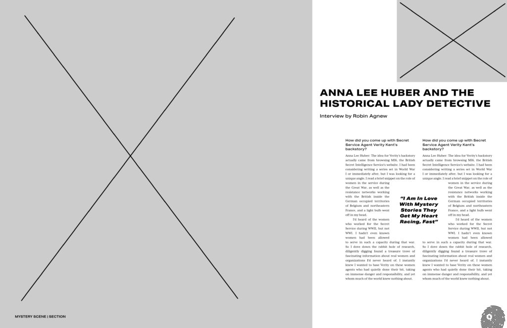
Skeleton Spread
A skeleton spread was created to showcase the use of typography choices and page elements. The used of the skeleton spread set up a blue print for the layout from page to page. The spread includes the placement of photos, the use of type-setting choices and the inclusion of pull quotes to be placed in between two columns on body copy. The skeleton spread also showcases the implementation of the brand’s sub-mark used as a folio on the right side of the spread with the folio on the left side indicating the section of the mystery magazine.
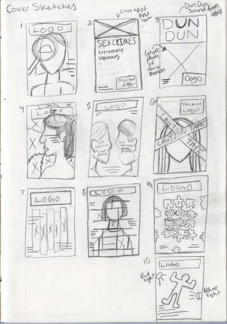
Cover Sketches
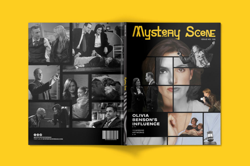
The intention for the front cover was to showcase the development of the main character from the popular television series, Law & Order: SVU. Corresponding to the feature story the goal of the cover was to not only reveal what the TV show is about, but to show the different sides and growth of the show’s main protagonist Captain Olivia Benson. After much debate and discussion sketch number eight was chosen to best achieve the cover’s goal.
Cover Digitization
The start of the cover’s digitization begins with a massive photo hunt. After choosing the right photos for the job. The creation process began in Adobe Photoshop, with the a heavy used of layer masking and layer adjustments. Piece by piece the cover was put together and was finished off with magazine furniture elements in Adobe InDesign in order to stay true to the type-setting choices. The cover progression gif below shows a quick snapshot of the editing process from adding photos, masking, adding adjustments and placement of masthead.
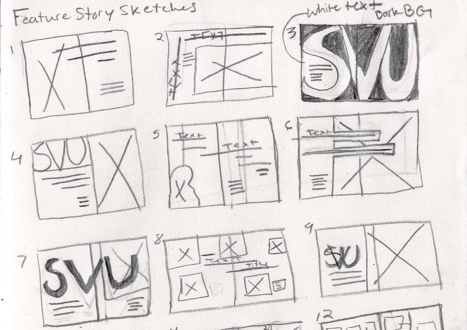
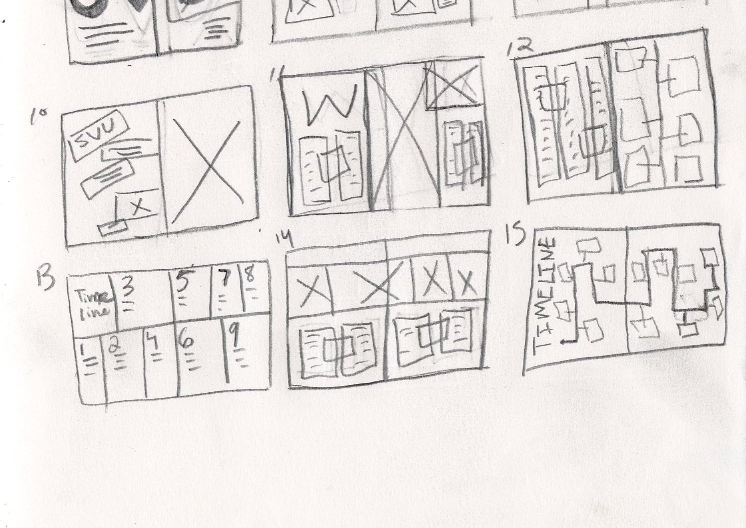
Feature Story Process
The initial intention for the opening spread of the magazine’s feature story was to showcase the ambiguity in the beginning in every episode of Law & Order: SVU. This ambiguity being; What’s this? Who’s that? What’s happening? and Who committed the crime? The main goal was to quickly grab the reader’s attention, spark their curiosity leaving them wanting to know more about what they are reading. After much debate and discussion sketch number three was chosen to best achieve the goal of the feature story’s opening spread.
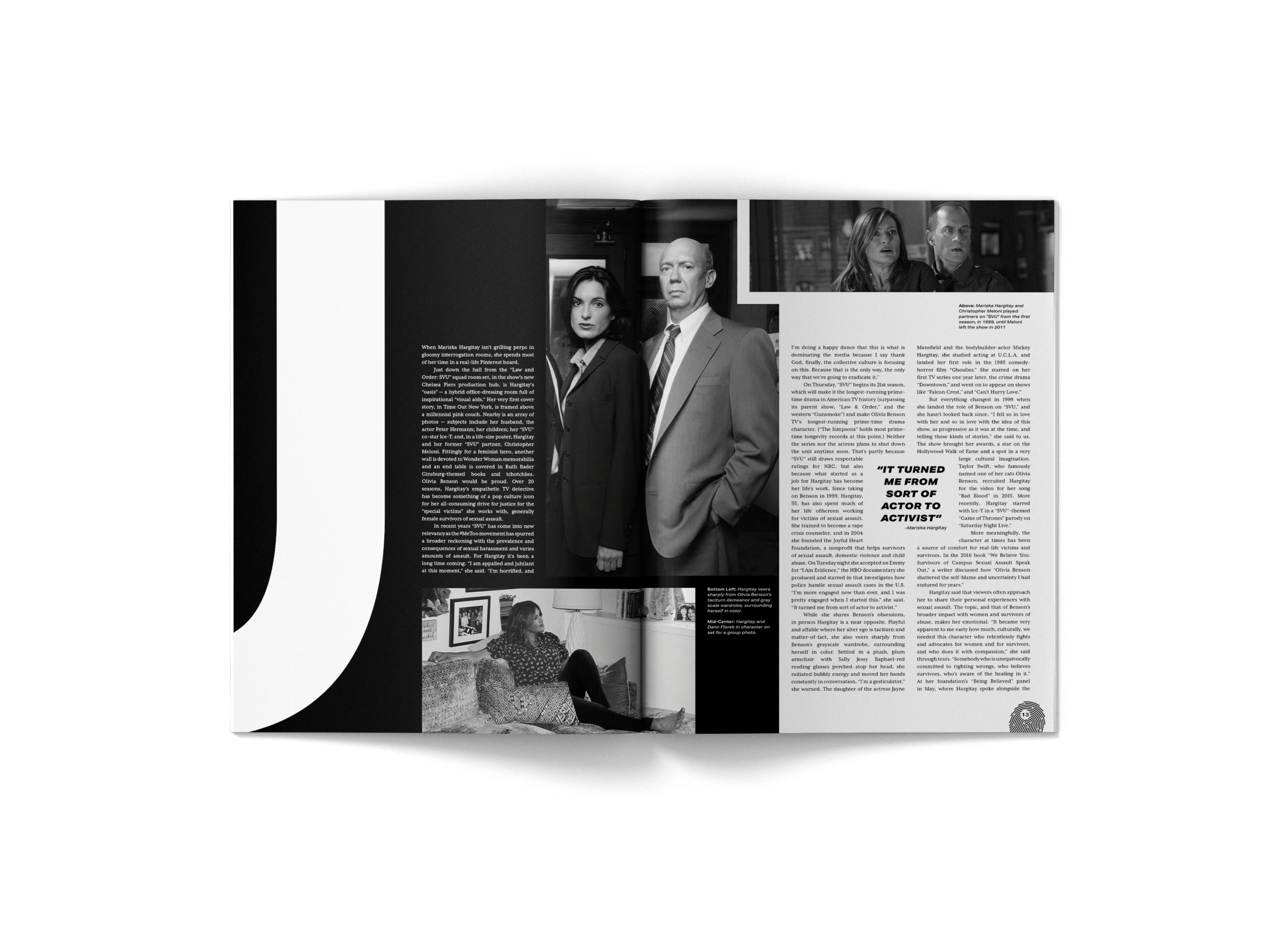
Final Feature Story
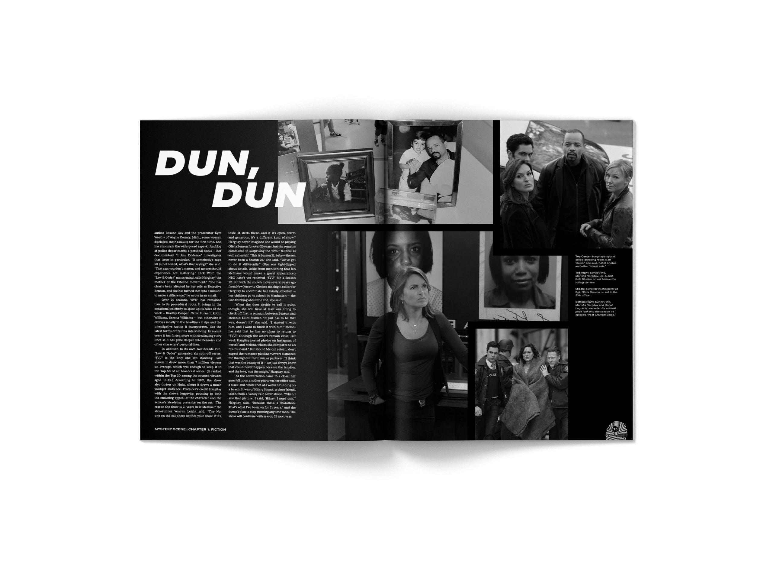
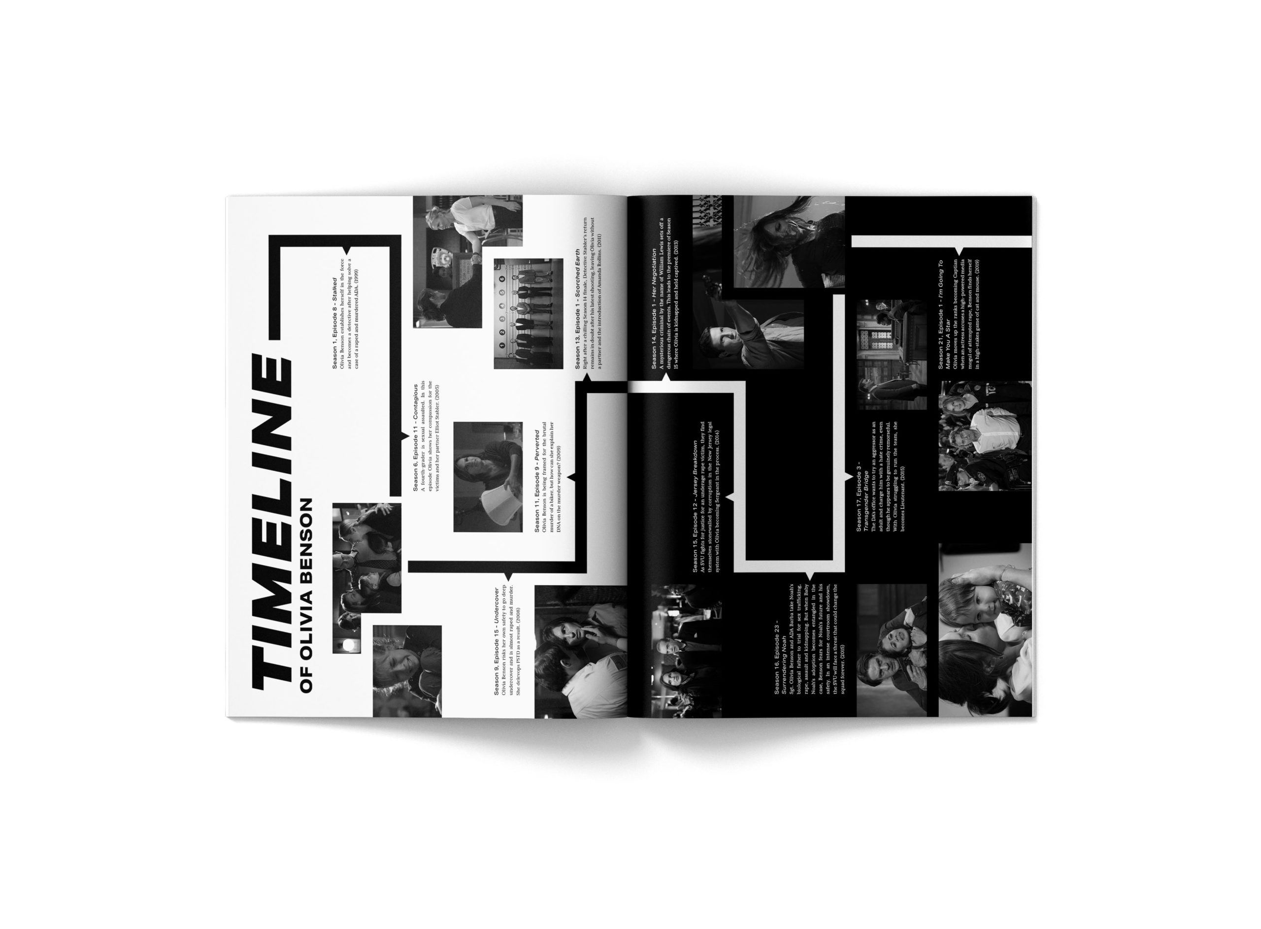
The finalize feature story includes an opening spread, followed by four pages of content and closing with a timeline infographic related to Olivia Benson’s time, character developed, milestones in her life and career. The treatment of black and white photography and type symbolizes the main goal of the almost every episode of the long-running crime-drama TV show, which to catch, arrest and imprison the criminal committing these especially heinous sexually based offenses.
Introduction Section
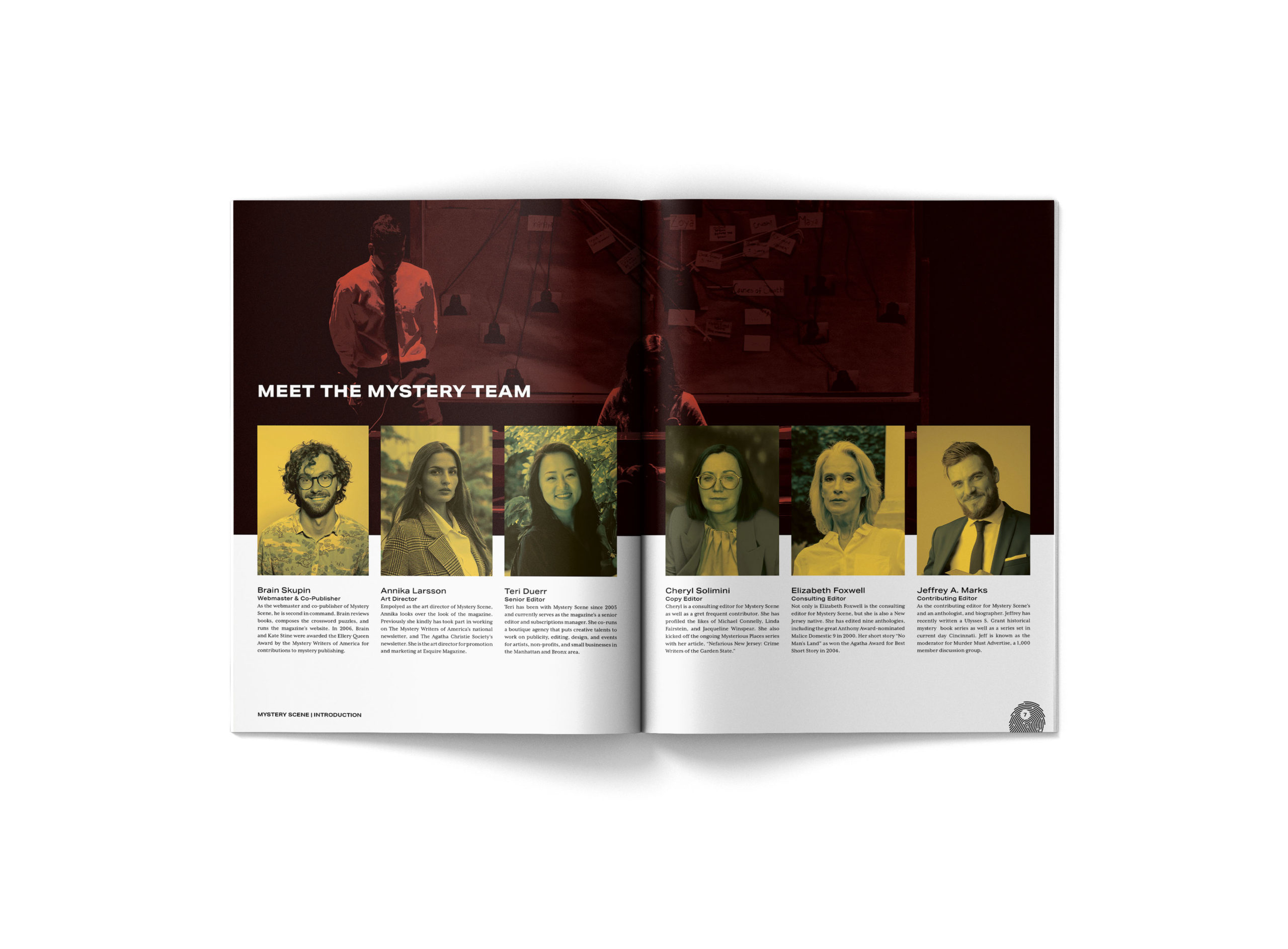
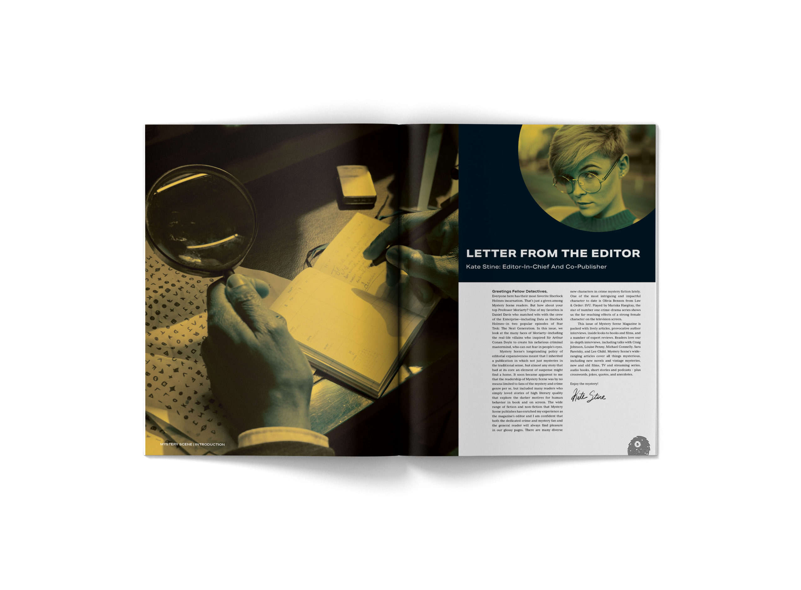
The front section of the magazine is comprised of four pages. This includes a spread with a letter from the editor introduction the magazine and the new issue, then the next spread is on the team behind the makings of the mystery magazine. Each of the section spreads along with this one, was an opportunity to show off the brand and keep the audience engaged and entertained.
Meet The Team
Letter From The Editor
Body Sections
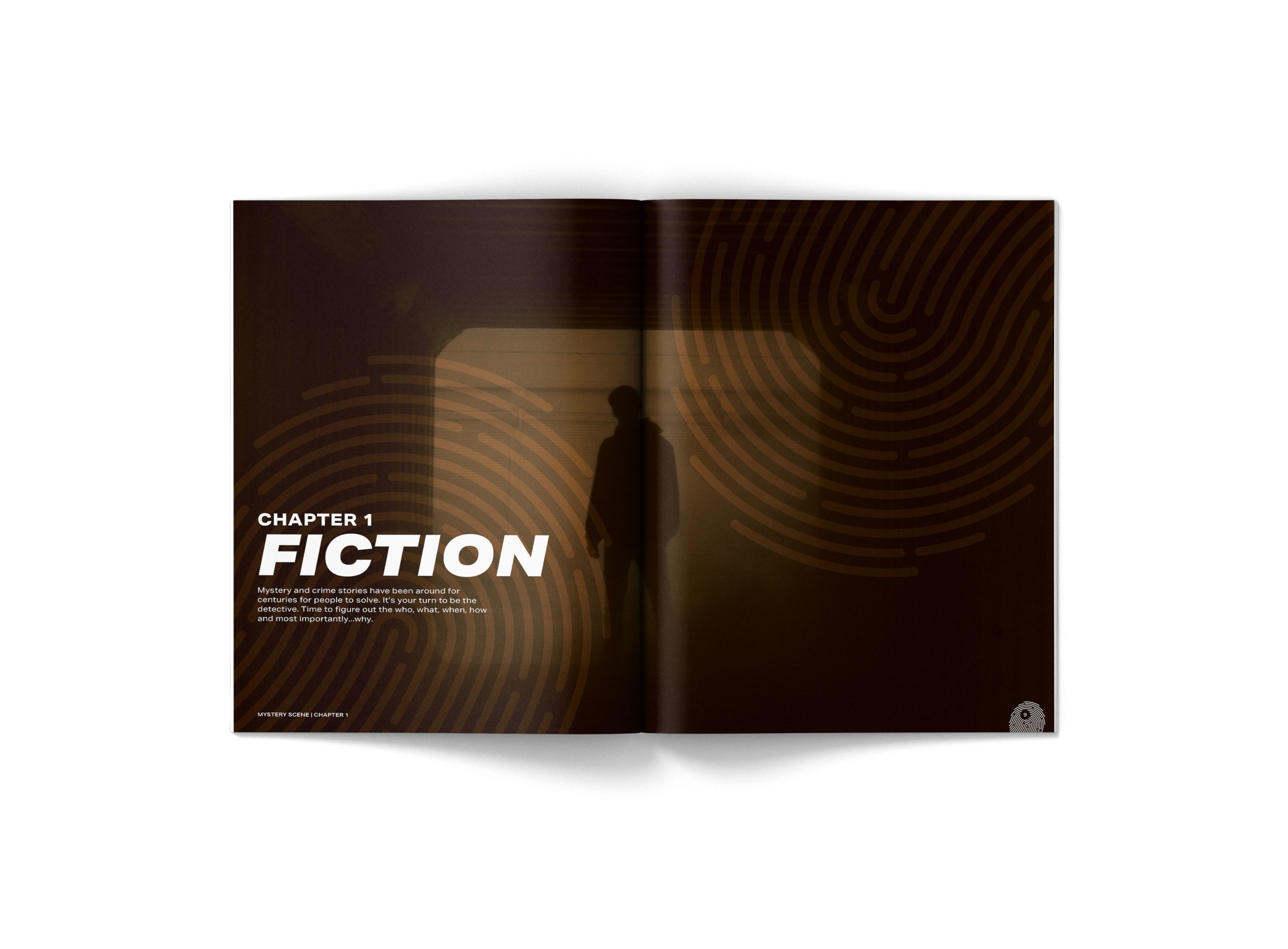
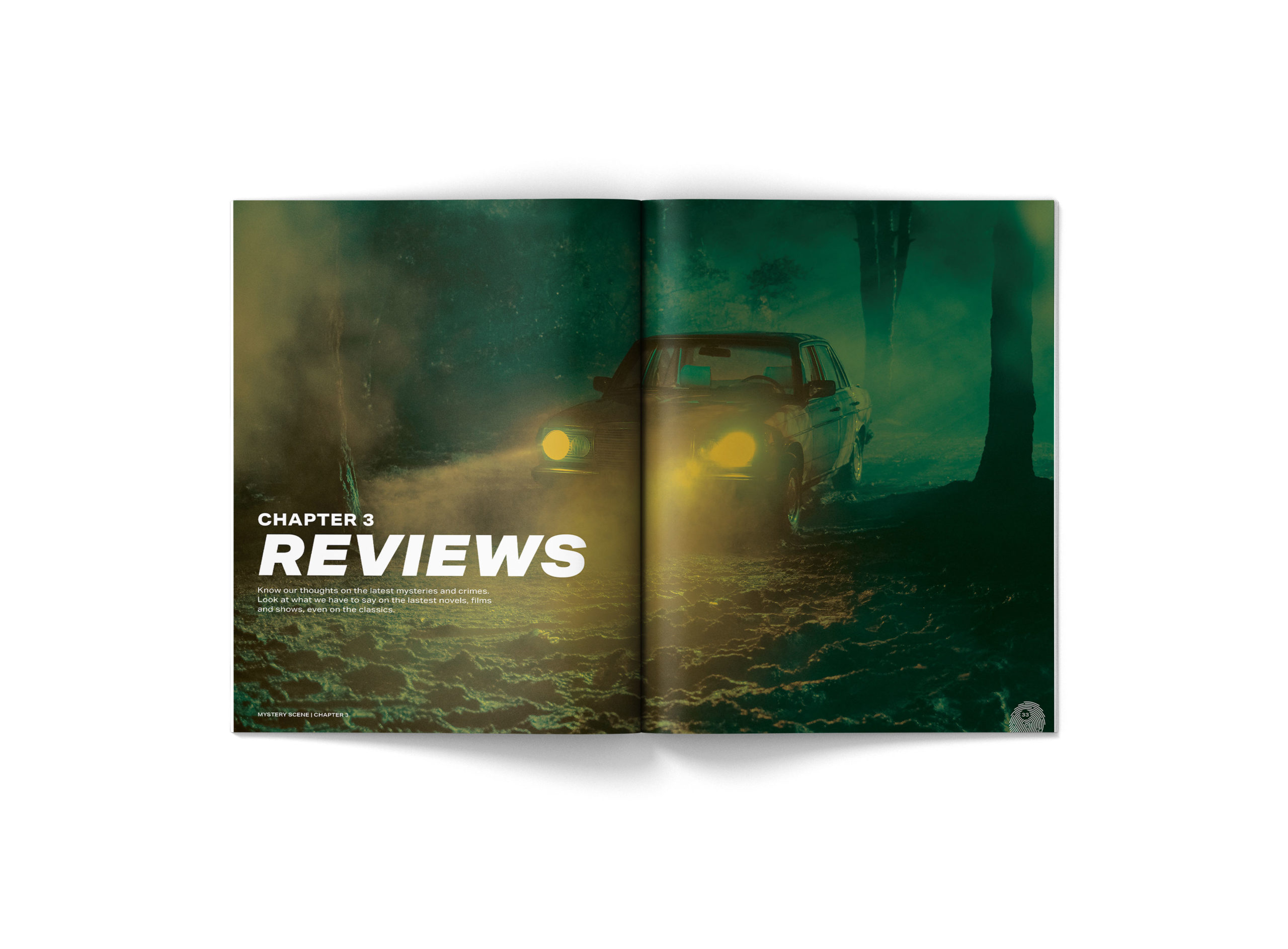
The main sections of the magazine are separated into chapters representing a book. By doing this the Mystery Scene brand is keeping true to its roots of being a literary magazine the focuses onmystery and crime genre. The body of the magazine is divided into three chapters: Fiction, Non-Fiction and Reviews.
Chapter 1: Fiction
Chapter 2: Non-Fiction
Chapter 3: Reviews
Closing Section
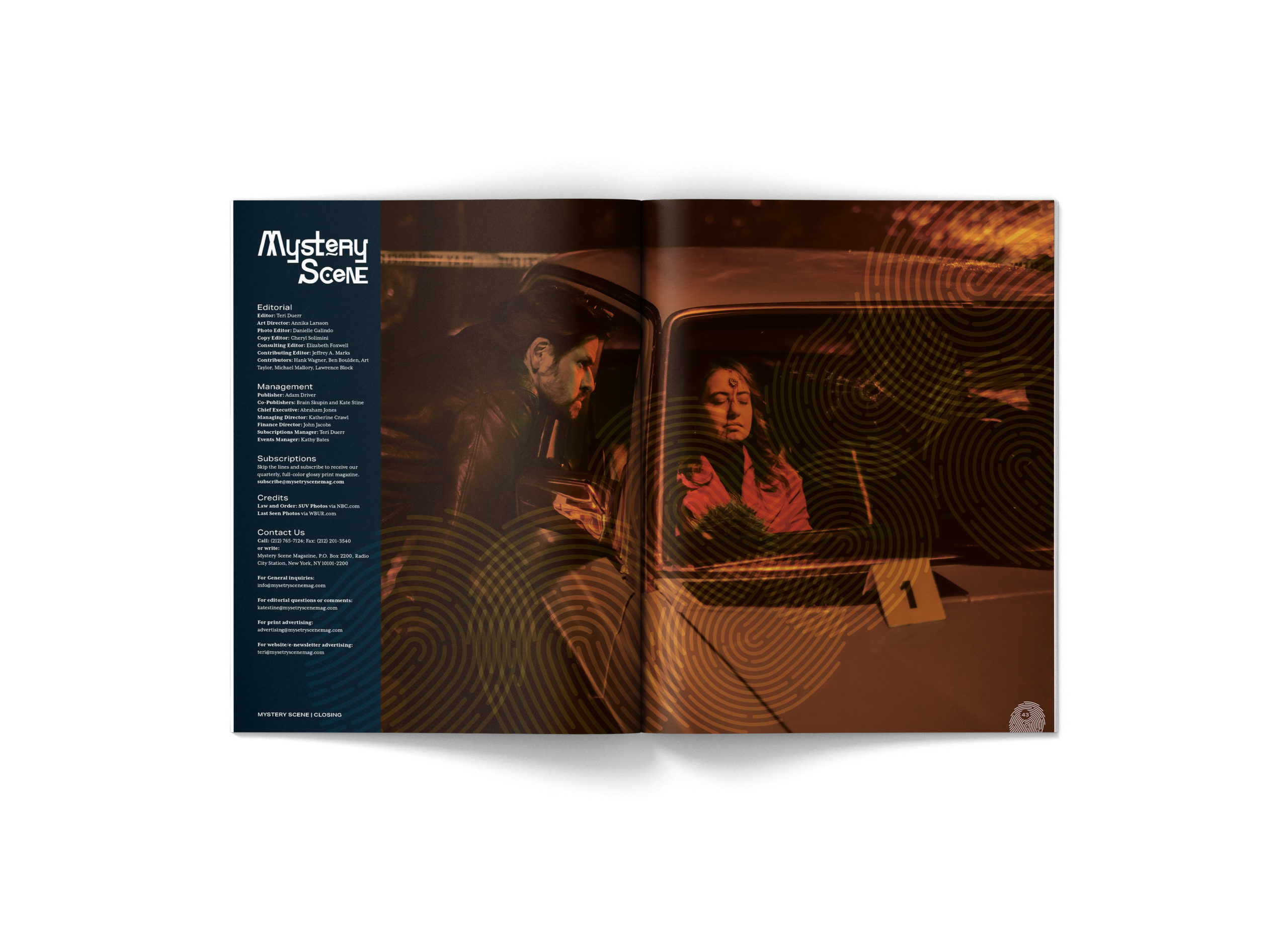
In order to keep the audience engaged as they reach the end of the magazine a spread of puzzles was included to test the skills of the reader. The first puzzle the reader gets to solve is a “Spot The Difference” game between two similar photos. The second puzzle the reader gets to try is a crossword game titled “A Case of Identity.” The inclusion of a crossword puzzle stays true to the roots of the magazine. Followed by that the magazine ends with a spread on subscriptions, contact and credit information.
