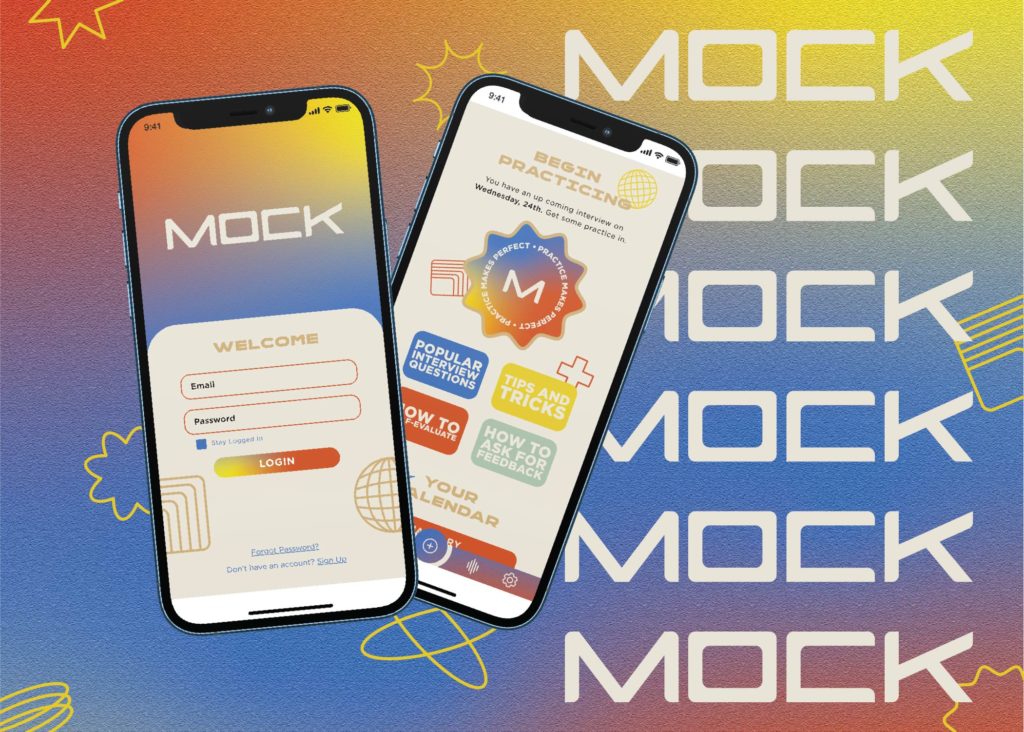
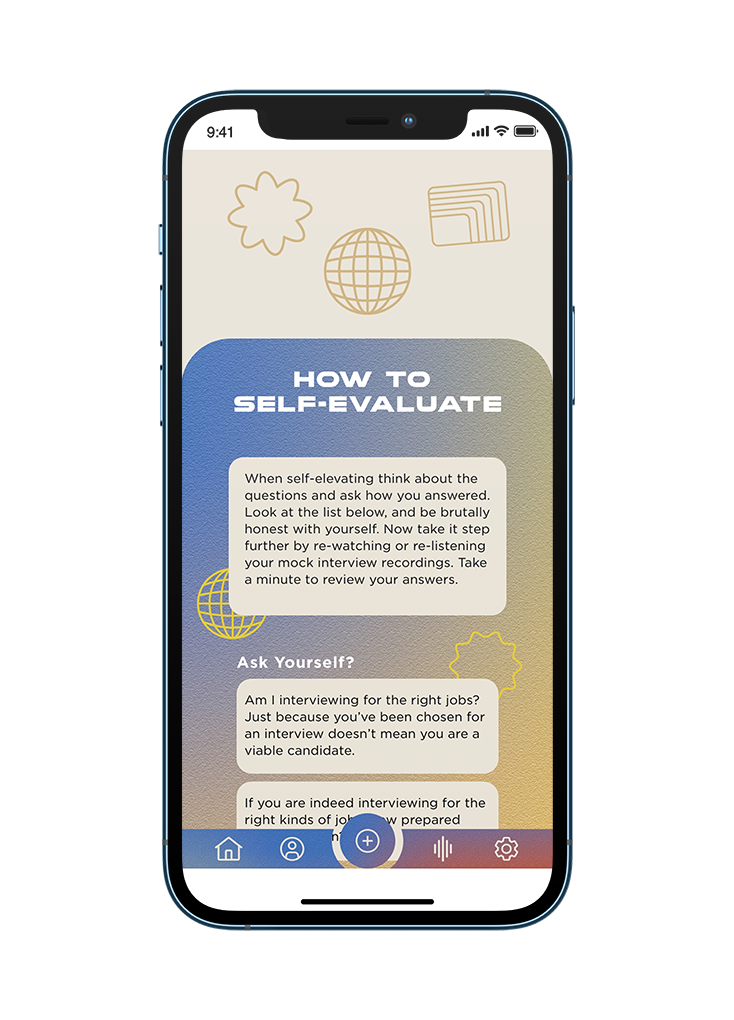
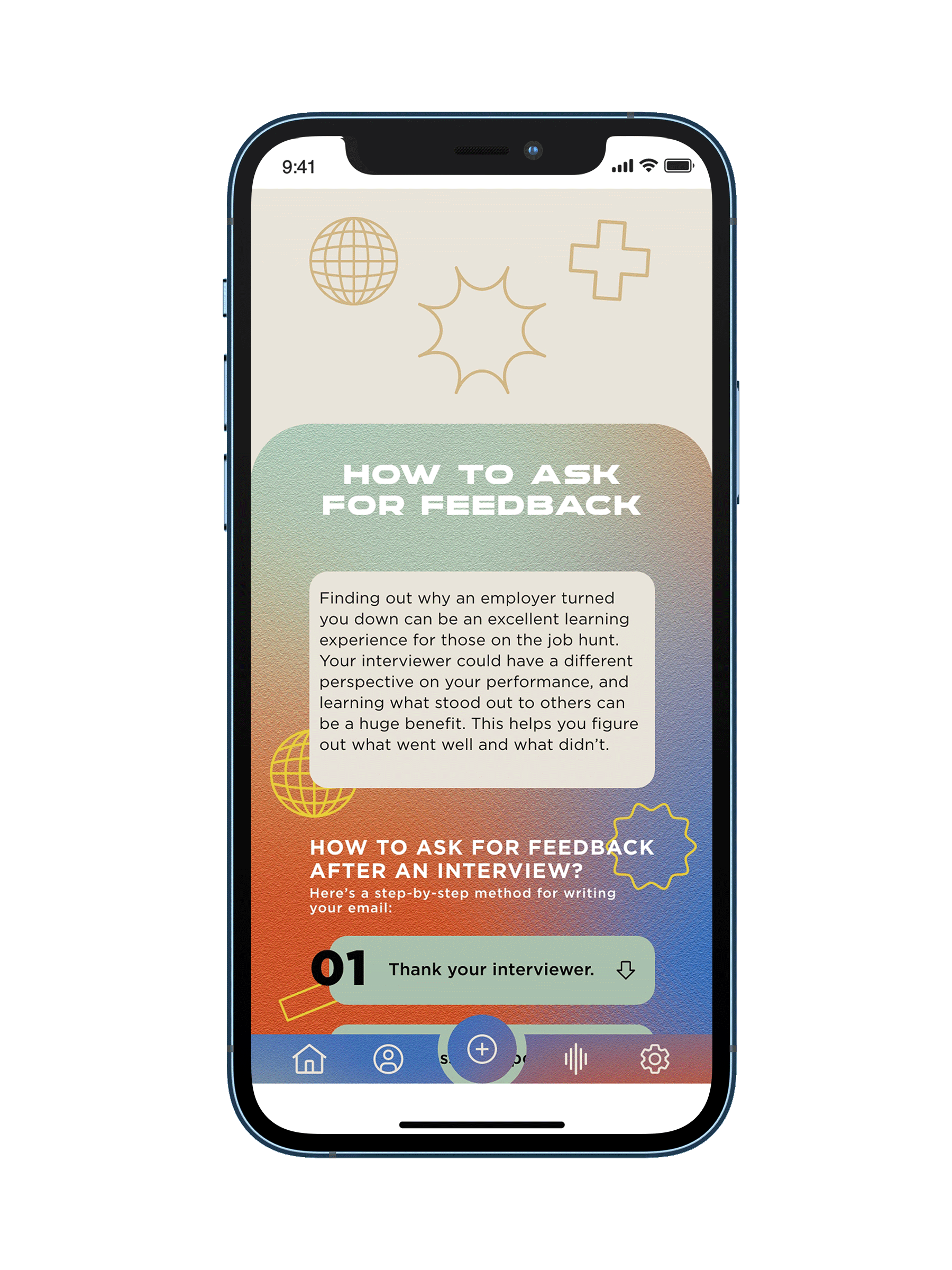
Mock is a mobile app that helps recent or soon be graduates with their interview skills, by providing mock interviews, important tips, how to answer questions and recordings of users’ practice for self-analysis and evaluation. The app allows a user to prepare themselves for that important job interview and feel confident answering some of the most common questions being asked.
Every year in the United States four million graduates receive degrees and complete college. As new post-graduates they will be entering the world with lots of new problems that need solving. So Mock was designed with smooth user flow in mind and was branded with visuals that relate to the target audience giving them comfort and ease to shake off the nerves in order to ace that job interview.
Research Survey
A part of the app design project was to conduct a quantitative and qualitative research among my peers through a research survey. In this project the UI/UX Design process was used to determine the problem related to post graduation that can be solved through the use of an app.
Competitor Study
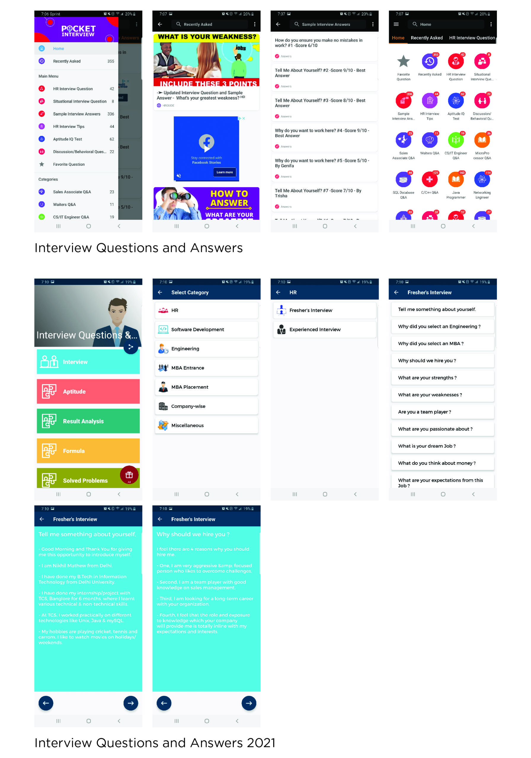
While conducting visual research two competitor apps while looked at. Both mobile apps lacked in engagement, visuals and unique names. When testing each app on flow, it took about 4 to 5 screen jumps in order to get the wanted content.
With gaps in the market this was the opportunity to create an enticing app for users. Once the study was done 4 goals were determined for the mobile app:
Providing a rewarding and friendly experience.
Give option to practice with an AI or live user.
Create an app with easy access to content.
Showcase engaging trendy visuals.
Logo Sketches
A number of logo sketches were done to begin building the app’s brand. The goal of the sketches was to create a logotype that has structure to give off a professional feel, but with custom features. Enough features to have a modernized look in order to attract users, ages 23–29.
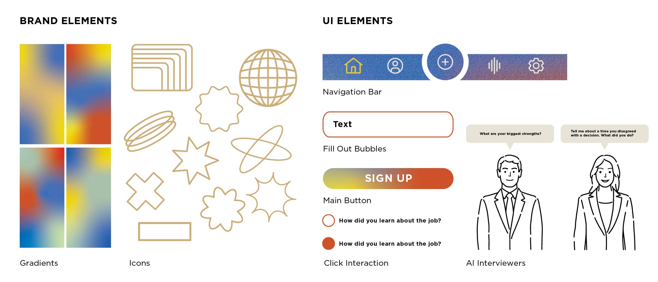
Brand Identity
The following is the brand standards for the app. Showcasing a logo with inner changeable career hat and career ties allow the user to understand that the app is meant to help get the job from all areas in the work force. The brand also includes gradients and icons to provide a friendly environment for the user to feel confidence when conducting their mock interview.
Color Palette
Using primary colors to attract interest in the app. The green and brown tones colors are meant to a create a comfortable and friendly space to practice in. The chosen typefaces were to match the styling of the app’s other elements. Gotham is a great typeface for UI design and provides a good family to establish hierarchy within the app.
Typography
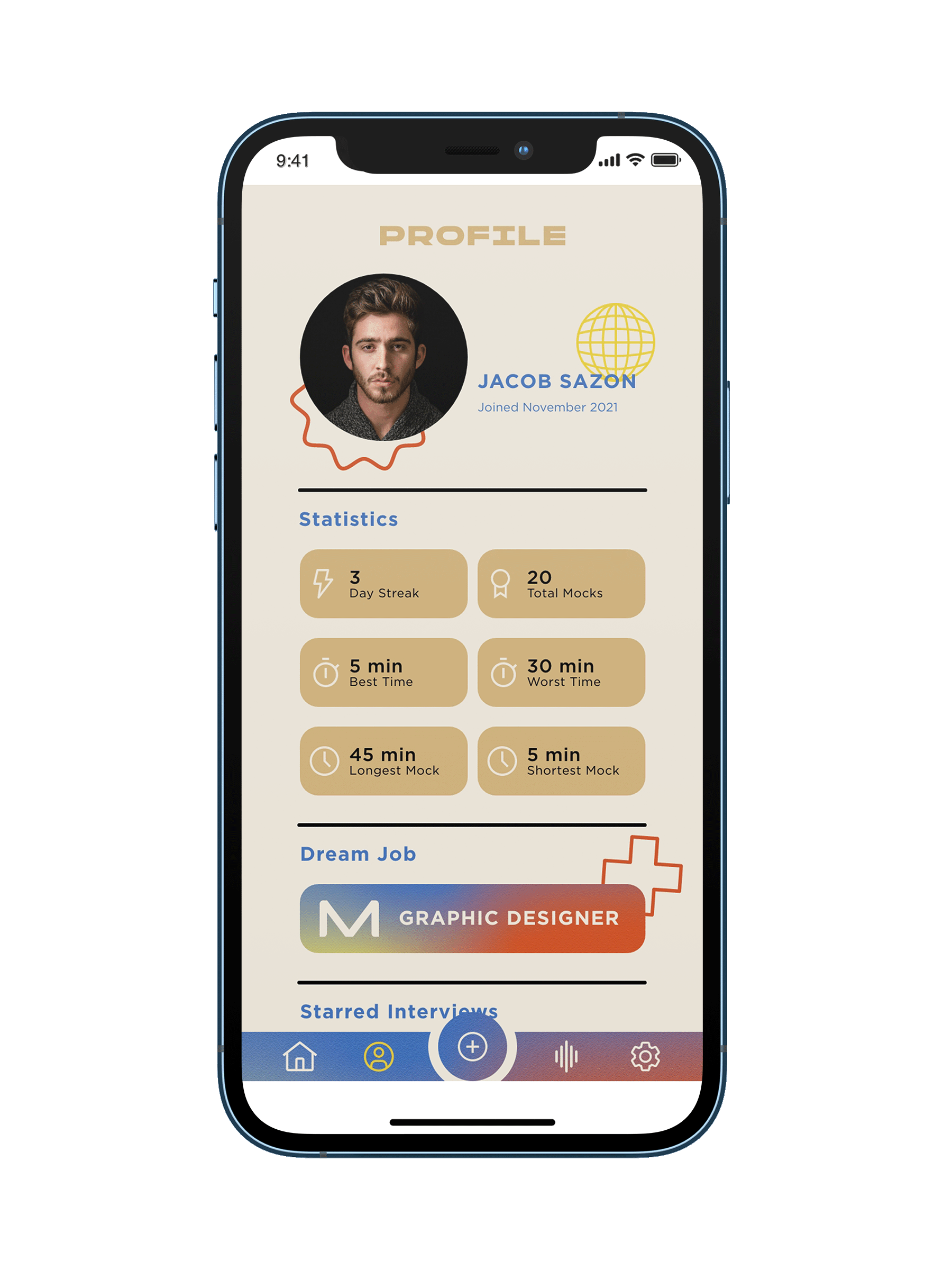
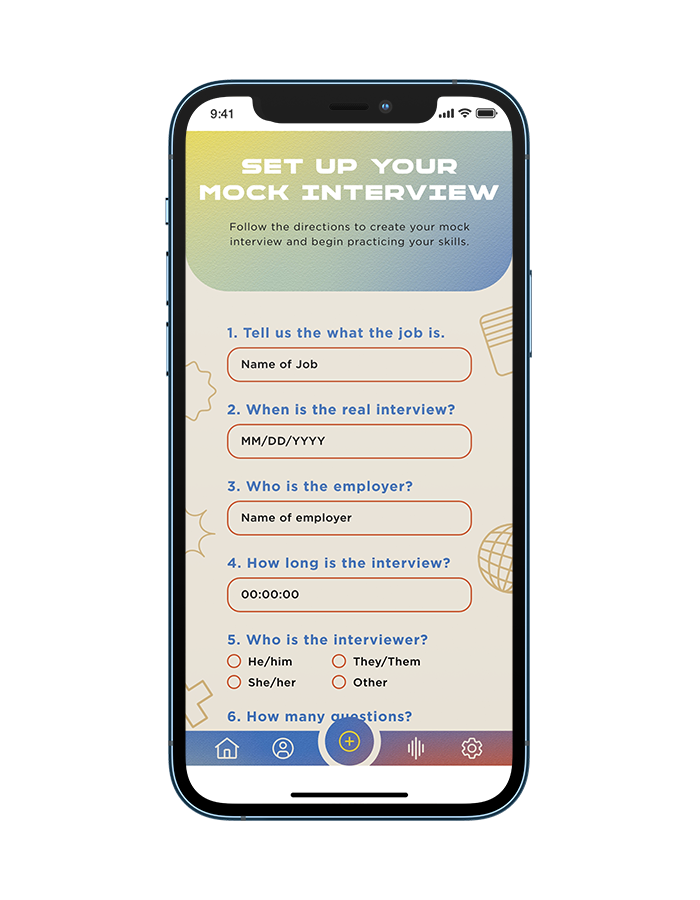
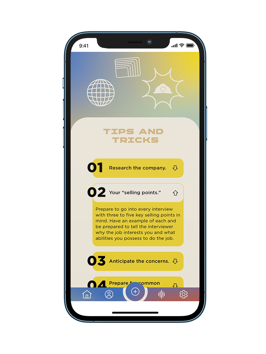
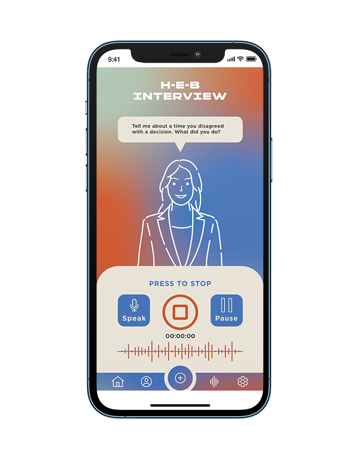
The following UI elements are to provide user engagement throughout the app. The elements also to support the goal of offing a rewarding experience and appealing visuals. The navigation bar provides quick access to the user’s home, profile, records, add new interview and settings page. Also shown is what the AI interviewer would look like when a user practices.
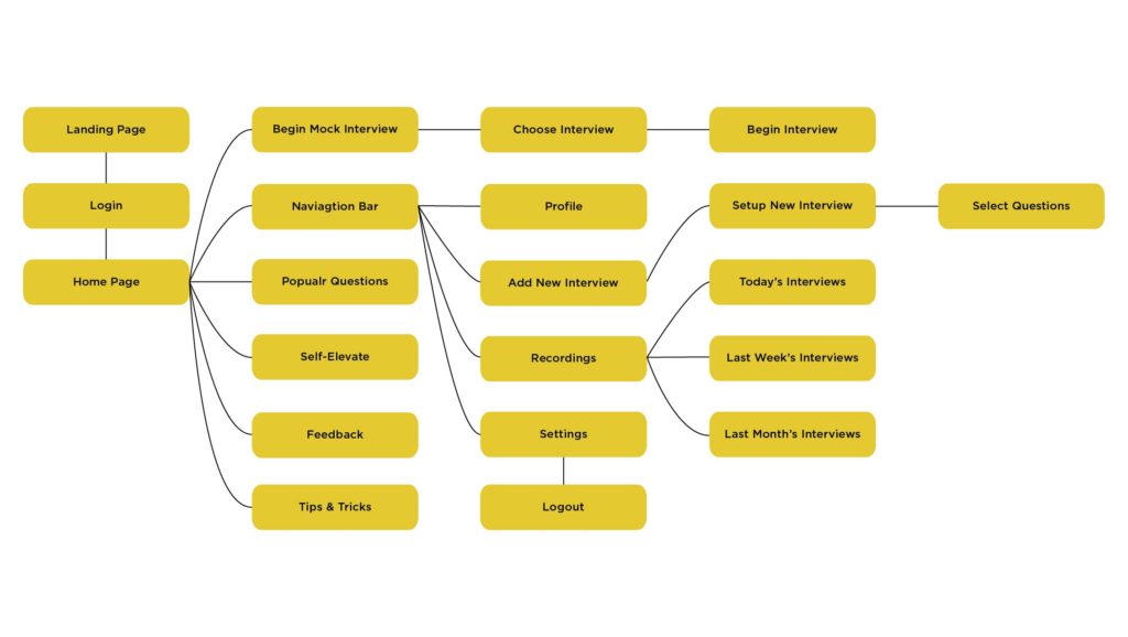
Sitemap & Wireframes
The following shows a sitemap, with a developed user flow for the app with features that will aid in improving a user’s interview skills. The sitemap provides the main screens intended for the users to utilize in their experience on the app.
Low-fidelity wireframes were made to support the outlined app goals. Throughout the process some of the compositional layouts did change. The wireframes acted as the base for the development of the high-fidelity screens, Adobe XD prototyping, and application of the brand.